Friday, October 30, 2009


This is a recruitment poster for the chess team. It was made by first making a nice purple background for John Bapst. I originally centered my logo on the page, but now it's on the top layer and near the top of the page to make room for Kasparov. I put the picture of Kasparov there to make it seem like one of those old army recruitment posters with Uncle Sam. I just used a transparency layer mask to get rid of the background around Kasparov so he actually looks like part of the poster. I put the nifty captions at the top and bottom, the last one being a pun on the chessboard (in case people don't know, the horizontal rows are called ranks).

It took me awhile to figure out what I wanted to use my logo for and how to do, but finally I saw this picture on the internet, and got a picture of a garage door because the original had some graffiti on it and I wanted to type the text that is now on the left side of the picture. I made the recycling bin before adding it to this picture. I took the bin and added my logo to it then the word 'Recycle'. I put the bin where it is now and created the arrow pointing to it. I had the text in the bottom right of the picture , but it wasn't visible, so I added my logo once again and made the text size smaller.

So, if you don't want your lawn to look like this, come and get one of out totally awesome recycling bins today!

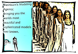
Washburn's Modeling Agency

Alright everyone, I thought I would get a little bit creative.. ish with this one. I started out making the blue background, then I found a picture of some models walking down the runway. After this, I wrote what I'm trying to promote here and then I slapped on my logo. The point of this is simple, This will be the best modeling agency ever! :D After I had finished those steps, I went over to filters and then I went and distorted the shape of the picture. After I had finished with this I went back to filters and then went to artistic and I made the ladies change in the cartoon filter to add more of an effect to the whole advertisement :p That's basically everything I did :p

This ad is for a multimedia printing company. They emphasize taking their client's idea and putting it pretty much anywhere.

For each "image," I had to find the starting picture online and then add the logo to it. In total, I actually had about 5 gimp documents open at once. Once each image had the logo, I had to save it as a png with transparent background and import it into the final ad. When the dimensions of the canvas were set, it was pretty simple just to move around the images to where they needed to go. I added a white background with a light blue gradient; solid white was too boring. The text boxes were simple, as was adding the logo and description. Hope you guys like it. I'm pretty happy with it.

Popenguin Car Insurance Advertisement 2 *High Quality Update*


Okay, so this is my updated 2nd Popenguin advertisement. It is basically the 2nd one, only I added the catchy equation in the middle of the screen. It's supposed to read, "Car plus Popenguin equals money" which I thought would be catchy to the eye as well as convincing to whoever sees the ad. I'm not 100% sure that it fits in with the rest of the ad, but please feel free to give your opinion to make my decision easier.

Crayons, ALL GNU.


This is an advertisement for a crayon company Proseart. It's a pun of Roseart, which might I add, is the crappiest crayon company ever. The crayons would be better as candles, they're so waxy. Anywhom.
For the background, I used gimp and just colored in the roygbiv rainbow colors with a paintbrush. Then I used iWarp to swirl them all around. Then, I created a new layer and made it completely black. I took the eraser tool and erased a lot of the black to make the rainbow show, but still give the illusion of the rainbow background being in the front. Then I added my star from inkscape. For the letters, I just typed them out with white and smudged them slightly to make them more ~swirly~ like the rest of the picture. The slogan comes from the definition of prose, which is "ordinary writing as distinguished from verse."

Off Roading Club

My add is for the the Off-Roading Club. In making this add I used a technique called put on path to make the top banner on a curved line. To make the words on a path you take the pen tool draw a line then you curve the line using that same tool. After you do that you need to put the words you want up, then go to text on the tool bar and pick put on path. After doing that I pasted my logo onto the center of my add. Then wrote about what it was and were it would be using the word art. Then turned it brown to symbolize mud or dirt. Join the Off-Roading Club.

Thursday, October 29, 2009

Prestige Worldwide Ad

Ok, so I have two ads here that are slightly different. I started out with a black backgrond and added the text from an online font generator. I found a picture of the two of them leaning against a car, so I edited out the car and put them together. I cleaned it up, lightened it to go with the starburst, and put it on the ad. For the first one, I wanted the logo to really stand out, so I made it really big and used it kind of in place of a starburst. For the second one, I played around with the light and effects filter, creating a starburst behind them, making them more central than the logo. To incorporate the logo into that one, since it was already slightly transparent, I placed it over the starburst, lightening and brightening the logo in the process. Let me know which one you like more or any suggestions!
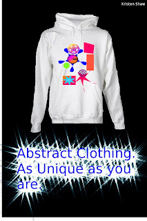

Abstract Clothing

This ad I have been working all week, mainly because I was messing around trying to figure out what to do with my logo. I took the sweatshirt picture and put it on a transparent layer and then erased around the white background that it was on. I then put my logo on another layer, resized it and then combined the layers. I opened another layer and typed the text in a text box, then to get the sparkly effect I made sure I had the text selected, went to filters-alpha to logo-frosty.

Nature Co.


This is my version of a Greenpeace ad. I wanted the company's name to look like clouds. To do that I used the fuzzy paintbrush to paint them on and the blur tool with the fuzzy circle again. The background is a basic gradient, just had to use the gradient tool. The erasing of the words at the bottom (for anyone that doesn't get it) is supposed to represent nature slowing disappearing.

Wednesday, October 28, 2009

First time in the world ~!


This is my company car and i choose the first week all the cars for free just for one week
the students can choos one car , the tetchers can choos 2 cars , but Mr.Murghy can choos 4 cars and it's special cars sorry i can't show you guys !! loool
we have 2000,000 cars waiting you to have it so come frist befor any one then you will get a car !
i Used in this picture some pictures of cars from googel and attached my company logo

Last qusition is : ( HOW IS BETTER THAN ME ) hahahaha

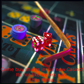
Casino


This is my new advertisement, it wasn't hard to make, I used the perspective, shear tool, and the scale tool to put my logo on the dice and the chips. Then i put the words in and I decided since we were supposed to convince someone to buy some shares from this advertisement by adding a little humor in it.

Popenguin Car Insurance Advertisement 2


Okay, so this is my second advertisement post for Popenguin Car Insurance. I basically did the same things that I did in my other post, only I rotated my penguin so it seemed as though he were peeking out from the corner of the image. Then, I just used the textbox tool to add the text to the ad. I tried to think of something funny yet convincing for the text. Please comment if you have any suggestions for me!

Gambit's Casino


This is a casino logo I thought would work well with the picture.

To create this I cropped the top of the picture and then found a good color, font, and size for the letters. Then I imported and shrank my logo for it to fit in the corner.

Tuesday, October 27, 2009


I first made the JMADE symbol with the star and letters. I then used the circle/oval tool to make the poker table and the black outer part of the table. To make the cards i just made one small box and copy and pasted it several times. Then to match them to the table I used the rotate tool. To put the letters on the cards I copied the letters on the logo and then resized/rotated them to fit to the cards! JMAde fyi is just a group of guys I frequently play poker with...

Popenguin Car Insurance Advertisement

This is an ad I created in GIMP for my Popenguin logo. As you can see, I went with my car insurance idea because I rather enjoy GEICO's style of adding humor to their commercials by using the gecko and the cavemen. To do this, I basically copied my logo into a background that I filled in with turquoise, since it seemed to go well with the yellow (if you don't think so, please leave suggestions of any better color combinations I could've used) which also led to my decision of the yellow text. That was just simple text boxing and whatnot.

Water Match

For this pic I took a flame made of water in a picture and a regular match picture and did my best to "merge" them so they look like one picture

BeatleGem Snow Equipment


This is my first ad. I thought it came out pretty well. I used the scissor tool to cut out a picture of a snowboarder i got off of google images. I then used my logo and rotated it and scaled it twice to put it on the snowboard and then again to make the bigger logo. I also used text boxes to give it a slogan like all ads have.

As I promised this is the first products distinguished!! This shoe it's not that usual
you can wear this shoes when you walk without moving your feet and also you do not feel hungry
or thirsty when you worn and it is good at the time of snow ans it's really smart she can do all your home waork and study for teasts or quizz !! and most importantly a very cheap price 2999,99 $

Monday, October 26, 2009

Got Nike's?


This is just me messing around with some shoes. What I did was googled a bunch of different colors of Nike's. I took a Nike sneaker that was a brownish color and green so that I could blend it in to look like its rooted to the ground. Then, I used a small paint brush, and made branches that stuck out of the "trunk." Once I found a sneaker that I wanted in my tree, I cropped it then cut it out. So, when I used the paint brush, the shoe was one of my options. I painted a bunch of each colored sneaker to make it look like the sneakers were the leaves. Then I went to filters where I went to artistic and then chose the cartoon affect.

Thursday, October 22, 2009

Designer?!

Alright so basically what happened here is I saw a picture like this one above as a designer's fashion line and i thought it was a really sick so i decided to change it up a little bit by first using gimp and erasing the head off of the body, then i did all the yadda yadda work and saved it and went over to inkskape and used the text creator to put my name next to it, maybe i'll be a designer in the future?! who knows! :D

John Bapst Chess Team !!!!!


This is a logo I made for the chess team! It will hopefully go on some posters I plan on making someday. First, I made a circle. Then I used the checkerboard pattern, but it was too small. So I selected the pattern and enlarged it, and THEN put it in the circle. Next I used calligraphy and tried to make the JB Chess look nice. To fit Chess into one line and still look large I adjusted the thinning and the fixation so it got thinner more often, which also made the h and the s look niftier. And I only did one s and copied it to make it look more consistent and professional. Next I used the pen tool to outline the pawn, and used the node editor to make it more smooth, symmetrical, and curvy. Next I made a circle to give it the bottom. Then I used the 3D edging effect to make it look more 3D. Unfortunately the tool didn't work on the chessboard because it's already black and white so it shades oddly, but it still looks decent in 2D.
I was making a logo before this one, but it didn't save when Inkscape unexpectedly quit.

I drew a strange shape with the calligraphy tool and filled in the negative spaces with hot pink. I filled in more with the green and then blurred those areas. I used the star tool to make one star I liked and copied and pasted it over and over again to get the same star. The various stars are rotated randomly, resized, and have a gradient. I selected and moved the gray section to make the logo look off-tilter. The blurry pink background is an extremely blurry circle.

I think this could work well for a bio company (with a few alterations). It could also fit in for an outside lifestyle company.

Prestige Worldwide

So... Since my first logo was an utter failure, I decided to make a logo for an entertainment company called Prestige Worldwide after the suggestion from a friend. First, I just had the blue circle for the earth and green PW for the "continents." To make the blue fade and look a little more earthy, I messed around with the fill. First I changed the fill to Radial Gradient. I didn't like the really light, drastic fade it gave me, so I edited the radial gradient by adding stops and changing the offset. For the PW, I changed around the size and italicized the letters by shifting it. I then edited the stroke style, making it bigger and a tad lighter. I used a really close dash and blurred the edges to 2.5 to make it look as natural as possible.

Enviroment


This is my logo for a envirmomental safety company.
I made most of it by using the wave tool on circles and made the tree by going to Effects->Render->Random Tree...

Ok, I hadn't intended to post this now but, and if you were able to post your picture without a white background, please leave me a comment saying how because I tried selecting it all and exporting as a bitmap but it doesn't show transparent. I tried saving this a .jpeg to see if it would post transparent as I had posted the others in as .png.

Star Patern

To make this logo i started with two 31 point stars the first one I transformed out using the shift key then had to shrink it down to the page size. Then I took the second 31 point star and transformed it in to get the black part of the pattern. The inside star is just a regular six point star that I rotated to be up and down to fit in the middle.

Hands Down Logo


My logo. I think I'll be using it for a random company or casino or something. To Create it I took a fist I found online and then outlined the whole thing in black. Then I deleted the actual image and filled it in with this. Then i added the HD and was done. I think it turned out well for a split decision in a moment of spontaneity.

Straight up G


This pic was made of pure Swedish skill and a fantasy beyond imagination.
Straight up G Airways is the new airline sweeping over the country and YOU my friend,
will not be able to resist traveling with this high class airline with Hooter girls at your service 24/7 and the greatest movie selection you can ever imagine. First class tickets for budget prices makes Straight up G Airways the PERFECT choice for everyone.
// Larsson, Magnus Larsson.

MTV

So I was thinking about watching Rob and Big while I was looking for a logo to draw, and there came MTV. First I drew the box to make the tv, then added the M to it with the text tool. I added the circle buttons and the base, then drew the stand under it. At the end I added the antenna to spiff it up a bit, andd that's about it.

Sun star thingy, AND a trashcan


For the trashcan, I made 2 circles with the circle tool. Then I drew lines to connect them. To get the trashcanish shape, I used the gradient tool. I used gray and white for my colors. Then for the clumps of trash at the bottom I used different forms of the star tool, changing their number of points and occasionally making them look like those little doiley things old ladies put underneath their kettles. This could be a logo for any trash company! Maybe glad, because a glad bag would be nice to keep the trash in.

The sun was pretty easy to do. I started with a red star and changed the number of points to one that seemed high enough to my liking. Then I used the "edit path by nodes" tool to make the points narrower and to slightly warp them to the left or the right. To finish the product, I repeated this for every color of the rainbow. I thought this could be a logo for skittles! Fun fact, if you move the scroll bar up and down infront of the star, it'll look like it is wiggling.

Obama Logo


As you can probably tell, I have a sort of interest in things pertaining to Barak Obama including both his ninja skills and now his logo. I started off with a blue circle, then used the small dot on the side to turn it into a semicircle. I then created another semicircle, only I made it white and smaller, and put it into the middle of the big blue one. After that, I copied the blue semicircle and pasted it to get an exact replica, which I then flipped vertically and made it red so that the two semicircles would be reflections of each other and make the "O." The stripes were a little difficult to make because I couldn't really think of how to make them (no erase/paintbrush tools) so I decided on making elongated ovals and rotating them to look like stripes. Finally, I made the edges of both of the semicircles slightly blurry by selecting them then right clicking and going Fill and Stroke where you can adjust the blur of the object as well as other things.

Lucky Lucky


This is my logo that i'm going to have for a gambling or something Irish. This was pretty easy to make, first i created a star with 4 corners and pressed shift and made it look like a 4 leaf clover, then i created a 3D dice and re-sized it. It took me a while but DO NOT have the cube selected and press on a color, it will make it look only that color with no edges so it looks like a blog of paint. What you need to do is to use the fill tool and fill in each side so it looks like that. Last of all i created a circle and copied and pasted and squished the circles on the top and to the right to make it look 3D and then I went up to effects, modify path, edge 3D to add that final touch.

Off Road

This is a logo for a Off-Roading Truck Club. To make this Logo I started out by Making the 4x4 part. Which I used the text box tool to make. I did the them each separately. I originally had them on just a plan background but then was going to add a truck picture underneath. So then I found a picture of a cartoon lifted truck and then colored it in using inkscape. To color it in I used the calligraphy tool to trace in the parts that would be different colors then used the bucket to fill in the big spaces. After doing that and talking with Mr. Murphy I decided to move my logo on to the bed of the truck. To color in the truck. Now we have the 4x4 Off Roading Club logo!

SCIENCE


This is my logo for a Science Company I'm going to call SCIENCE!

First I made a green star and modified the effect. After, I went to Object->Fill and Stroke... and clicked the box to make overlapping parts transparent. I then made a blue circle and used the wave tool with max force and made the circle into the four boomerang things. For the finishing effect I selected everything and went to Effects->Modify Path->Edge 3D...


For these logos, i used some of the basic tools in a different way than they normally are to create my own shape things. The top one kept getting cut off at some points, but they arent too important so the logo overall is the same. For the top logo, i first made a normal five point star. then I used the 3D box tool and made weird looking green segments and angled them over the star to a position that I think looks pretty cool. then i made the spirals by using the spiral tool then adding color so they had a rather cool look to them. Lastly I put the letters J, M,A,D, and E on the star. these represent peoples names that i frequently play poker with.
For the bottom one, I used the 3D box tool just like before but used the segments to create a box. Then I used the caligraphy pen and did my best to draw something, and it turned out to look like a seven so I went with it. I then made a small star and copied/pasted it many times on the inside of the seven. After that made a letter box and inserted the words "lucky seven" into the seven itself. to make them fit i used the angle tool to rotate them so they would fit.

Shocker Shoes


This is just a logo that i made up on the top of my head. I made a star with the star tool, then grabbed one of the white boxes on it and reshaped it to look like a house. Then, I put another star on top of it and reshaped that one to be thinner. I was going for a weather vane look. Then, I chose what color I wanted the stars and writing to be. I used the text tool to put the letters 'SS' inside of the star.
The 'SS' inside of the star signifies the name of the company; Shocker Shoes.

Abstractness


I was just playing around with the gradient tool(which is wonderful for finding colors that complement each other. I am basically using the star, spiral, circle and rectangle tools and messing around with the shapes. This could be a logo for a clothing company.

Wednesday, October 21, 2009

Recycle!


I started off by created a star, and then I added one of the swirls into the middle of it, which you can't see any more. I added the light blue stars into the sides of it, making one and then copying and pasting it around the star. I then created a pentagram and made a green color, and copied and pasted it around the little stars. I then made a white triangle and did the same to all of the pentagrams. I made an orange-ish triangle and placed it within the points of the stars. I realized then that the green pentagrams and triangles reminded me of the Recycling symbol, so I made a larger one of those and placed it in the exact middle. This would be a logo for a recycling company.

Computer Glitch WIN!!!


I thought that this would make a good symbol for a car company or something. To be honest I don't know how i managed to get the black things. I made a star with 16 corners and started using the wave tool just messing around. Next thing I know the computer deleted most of the star leaving the basic shape. I decided to copy the shape, flip it and make it into a ring. Then I made circles and used the gradient tool.

My company logo


This simple logo reflects the first letter of my name Abdul and the first letter of my last name Fayez
i used in this logo the amazing program it's Shortcut to inkscape program is very cool
i used the pen and each incorporated some of the colors such as blue and yellow
And i used the star icon is very impressive given the form of a beautiful logo
I hope that my company logo to be beautiful:) and it's comming soon just wite my logo is the (( sheapest prices ))

Funky Logo


I wasn't sure exactly what I was going for (I was having a hard time working Inkscape), but I started playing around with circles and had a lot of fun.

I made a bunch of different colored circles, went to the edited objects icon (next to the text icon on the top bar) where I was able to adjust the fill colors, stoke color and width, and the transparencies of both. I also found the alignment tool which enabled me to put certain items below or above others. I used the wave tool to alter the shapes of the circles. I put a few stars on, altered their shapes, and played with transparency. My final step was putting in a few more circles which I blurred and sent to the very back.

For just kind of going with it, I pretty happy with the overall look. The logo really looks like it would work well with a clothing company.

Popenguin

I made this logo in a spark of randomness that came upon me. Originally, I had just wanted the penguin but then I thought of what I could add to the penguin to make it better. Then it hit me... Pope Hat! And thus POPEnguin car insurance was born. For the slogan I'm thinking of something like: "Popenguin car insurance. Sure, our company makes no sense. But you know what we know makes sense? Saving money."
As for the design of the logo, I started off using the circle tool for the body, head, eyes, and white belly. For the wings, I created a thin oval and used the wave tool to manipulate it into a wing-like shape, then copied it and rotated the copy to have two identical and symmetrical wings. I used the same method to make the feet. For the beak, I created a triangle and used the shift function to make it more round, then used the wave tool again to form it into more of a beak-shape. The pope hat was drawn completely with the freehand line tool.


I made this logo for one of those companies where you can "buy" a star and name it (I made up the company). I used a pink background. I used the text to write Catch and Star, added a star, and expanded the top "arm" of the star. I then wrote the A in pink. When I put it in Gimp to get transparency, I set pink to alpha, leaving me with the font and the cut-out of the A.

Monday, October 19, 2009

Very Basic, Very Awesome


This took 2 steps total. I made a "star" with 29 points. Then i used the shift and move thing that I discovered and made one quick motion and it came out like this.

Crazy Sunflower

This is a sunflower logo that could represent Sun Chips or a children's programming network. I started with a star and upped the corners to 47. Then using the spiral tool I changed the amount of turns. With the calligraphy tool I drew the stem and then I got two circles used the tweak tool. I drew the lines of the leaves with the Bezier tool. Thanks to Caleb I got the stem under the flower by lengthening the stem and then pressing page down.

Organic Anyone?


This kind of reminded me of something you would see on a label for organic food or something to do with nature. I started out by making the sun by using the star tool and upping the number of angles until it turned into a sun. I also used the calligraphic tool and made the tree trunk. Then on a new layer I made a circle and made it into more of a pac-man shape. Then I used the wave tool to make it into more of an oval shape. Then I used a rectangle to make the grass.