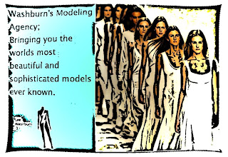
 Alright everyone, I thought I would get a little bit creative.. ish with this one. I started out making the blue background, then I found a picture of some models walking down the runway. After this, I wrote what I'm trying to promote here and then I slapped on my logo. The point of this is simple, This will be the best modeling agency ever! :D After I had finished those steps, I went over to filters and then I went and distorted the shape of the picture. After I had finished with this I went back to filters and then went to artistic and I made the ladies change in the cartoon filter to add more of an effect to the whole advertisement :p That's basically everything I did :p
Friday, October 30, 2009
Washburn's Modeling Agency
 Alright everyone, I thought I would get a little bit creative.. ish with this one. I started out making the blue background, then I found a picture of some models walking down the runway. After this, I wrote what I'm trying to promote here and then I slapped on my logo. The point of this is simple, This will be the best modeling agency ever! :D After I had finished those steps, I went over to filters and then I went and distorted the shape of the picture. After I had finished with this I went back to filters and then went to artistic and I made the ladies change in the cartoon filter to add more of an effect to the whole advertisement :p That's basically everything I did :p
Subscribe to:
Post Comments (Atom)
I like it, but is there anyway to make the border a little farther out so it doesn't have to bend around your text and logo?
ReplyDeleteawesome. just awesome.
ReplyDeleteI tried fixing that, Anna, But it kept making the image look weird and stretched to far, so i thought i would just keep it as is. Gimp failed me! :p
ReplyDeleteNice job! I really like the cartoonish effect on the models.
ReplyDeleteWell, at least you tried; it still looks really good though!
ReplyDeleteThank you! :D
ReplyDeleteI like it. It looks like a business card. The best way to get the border to fit is to alter the size of your canvas (aka the area you're working on). Go to (I think) Image--Canvas size. If you want the same proportions, keep the lock on. As you adjust hte pixel size the preview will show the final size. You will probably have to move stuff around a little bit, but you'll have enough room for the text.
ReplyDeleteOhh okay! thanks Katy! :D
ReplyDelete