Tuesday, September 29, 2009

Erin Bousfield's Eyes


The top photo is Erin Bousfield's eye after I modified it. The bottom photo is the original picture.
On the soccer bus, I was taking pictures, and I noticed the distinctive color and designs in Erin's eye, so I took a picture. She wanted to see what she would like like if I took out the slight wrinkles around her eye and removed her freckles. First, I did the wrinkles. I used the heal tool with a small brush to eliminate the lines. It wasn't too hard, I just had to make sure I was following the lines of her wrinkles. Then I started to work on the freckles. At first, I was just using the heal tool, but it was just lightening the freckles not really eliminating them. To even out the skin tool, I decided to use the airbrush with the large galaxy brush. I used the color picker tool to choose a color from the paler part of her face and lightly covered some of the more uneven/freckly areas of her face. I then used the heal tool to make it appear more realistic.
While I was zoomed in working on the skin, I also noticed some stray hairs on her eyebrows. So I decided to "pluck her eyebrows." I used the heal tool to get rid of some of the stray hairs and the airbrush with the heal tool to thin them out on top.
The last part was the eyes. There was a reflection of us on the bus in her eye and I wanted to get rid of that. First, I used the ellipse select tool to work with her pupil I used the color select tool to get the color of the pupil (it was not pure black). With the ellipse select tool, I could just fill in the whole thing and didn't have to worry about going outside her pupil. Then I had to get rid of the reflection on the iris. I used the scissors select tool to choose a "slice" of her eye where there was no reflection. I then copied this and pasted a few copies. I then put them in place and rotated them to go around the pupil. The third "slice," which was at the top of the iris, was too light for where it was in the eye, so I used the Brightness-Contrast under Color to darken it. I then used a small brush to smudge along the lines of the different "slices."
Erin's face turned out a bit more alabaster-like than I wanted, but I'm happy overall!

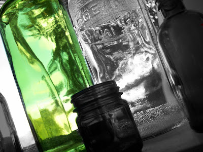
Bottles


This was a pretty easy edit. I duplicated the background layer and then added a layer mask. Then I selected the second layer and went colors-->desaturate and made the whole picture black and white. Then I took the paintbrush and with the full transparency mode i colored in the green bottle and left the rest B&W.

Shoopus Mah Whoopus!
Okay, this picture was inspired by a short online video compilation called "The Lazer Collection". If you haven't seen it, I highly recommend watching it sometime. The guy who made it knows his stuff. To make this, I used a picture of Daniel Radcliffe from the Harry Potter movies in one of his signature "spell casting" poses, then pasted the signature gigantic mouth at the tip of his wand using the resizing and move tools. After that, I found another picture of a laser, then pasted that using the same method as I did the mouth, so it would look as the the mouth was "Firin' his lazor" from his mouth. I chose to put in the captions above for added effect using the icanhascheezburger.com lolbuilder. I also recommend taking a look at that site as well if you haven't. You'll find that there are much better ways to spend your study halls.


this is a uniform in saudi arabia if smo budy want's married
i used a new tools like filp tool to move a back groun picutr to be like a papr of book
so .. also i used coulor pruch to make it nice
and i used a opacity to make to pictur in one picture
in this pic i used three layer my pic , another pic and color layer

Obey The Dress Code!


A little something that I spent a few minutes on. I lowered the opacity of the brush to do the eyes and blacked the backround to get the outline right.

Now you obey the dress code...or else!

Whoaa


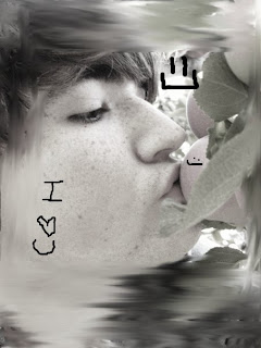
Alright so what I did here was I took a picture of me apple picking (again) and edited it up to make it look really cool :D Basically all I really did was zoom in and color in my eyes to the blue color, I thought it looked really neat, i also made it more transparent. Then I went over to the apple, wrote on it, put the green color on for the veins of the leaves and then i went and smudged out the background to make it look sort of like a pastel painting. I think it's quite neat.

Obama Ninja!

Well, I'd have to say that this is my best edited photo yet. Even though it only took me a few hours to complete, it is probably one of my favorite pictures I have ever created. All it took was Caleb's method of layer masking (which I will probably be using fairly often). I started off with the ninja, who just had a dark body and sword with white eyes. Then, I found a picture of Obama, and cut and pasted his face onto the ninja. By using careful moving and resizing, I fit his face to be on line with the ninja's, then used the layer mask trick to erase part of his head, making it look as though he was covering all but his eyes and nose. Then came the idea of replacing his sword with something a little more... interesting (Thank you Sam for the idea). I found a picture of a lightsaber, then did the same thing I did with the face, so that it would look as though he were holding it like he was the original sword. And Voila! Obama Ninja was born!

Monday, September 28, 2009

confusing


simple drwa

Dragon

These are two photos that i took at my house of two clay dragons, I took a different photo of each one and for the darker one i erased a lot of the photo and just left his head. After that i put it on top of lighter photo. I then put super novas under the filter tool, light and shadows, then super nova. I changed the color for red and blue for the different photos. I then used the burn tool and burned the dragon with the red nova for his eye, and i made him look darker(before he was the same color as the dragon with the blue eye).

Strikeface


"I want the Gimp Chico. And every tool in it" Thus led to the birth of Strikeface. Just a basic photo edit but I like it. It took forever to get the skin tone decent and to edit in there just right.

Apple Picking :D

Alright So obviously this one was really easy, I went apple picking over the weekend and took a few pictures that I liked. I tried putting a face on the apple but it was an EPIC fail, so i thought this was good enough :D So all i did was use the smudging tool around the edges to make it look more like a vortex. And then I added the smiley faces and the writing. Again, it's just a simple picture, but hey, it's my first upload for editing a picture, who cares :p

Eye Hands


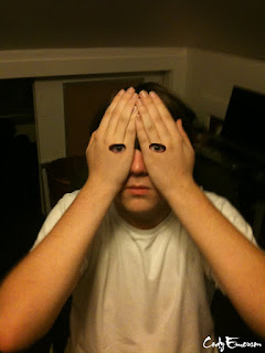
This picture took me all of about ten minutes to do, but I noticed that there were a lot of pictures like this online that people had done with GIMP and I wanted to see what I would look like. Unfortunately, it didn't really come out as awesome as I thought it would, so I'm a little disappointed. But hey, at least I can say I did it. The procedure was fairly simple. First, I cut out my eyes from the first picture I took using the rectangle tool (one at a time) and pasted them onto my face. Then, I used the move and resize tools to get them into the right positions on my face. After that, I used Caleb's method of making the pasted layers into new layers and then adding a layer mask so as to remove the access on the eyes.

Friday, September 25, 2009

Face Edits


I know we aren't required to post a picture this week but, I've been practicing at home on Gimp with face editing. This was actually the third one I made and probably the toughest. I took a picture of NCIS's McGee and copy and pasted his face on a picture of Abby Sciuto's. I made a new layer and layer mask, then started sizing and fitting his face onto hers. I took the black and white colors and started mixing their faces together. I gave the child McGee's eyes and Abby's nose and lips; I then smudged the colors in their faces together. I took off Abby's customary pigtails to make it male and then copy and pasted the new face on McGee's body. I had the hardest time trying to mix the left side of his neck to look realistic and his left ear too. But this is what I came up with; Abby and McGee's child!

I took a picture I had of Naruto Uzumaki and then I went to a picture of Edward Elric and copied the face and pasted it on Naruto. I made a new layer and added a layer mask. I then went to work with making sure his face was big enough to cover Naruto's and sized properly. I used the mask and the black and white colors to make it look like this. Very simple and the easiest out of the three pictures for me to make.

This was the second one I made. I took a picture from Naruto of these four ninja. I then took a picture of Ichigo Kurosaki and pasted his face on the blonde kid, and did the afore mentioned and mixed the skin so it looked right. I then took a picture of Yoruichi and pasted it on the middle kid and fixed her skin so it would look better and I made sure the bangs of the original came through. I took a picture of Tatsuki and pasted it on the farthest kid to the left and fixed that one up quickly. Finally I took Kenpachi Zaraki's face and placed on the one to the right and fixed that one. The problem was his face is a little wide now. Basic editing and the same thing done over and over.

Thursday, September 24, 2009


This picture was originally Just the letter A I found online. I happen to be a fan of dance, so i decided to make a collage type thing with my first initial, the letter A. I spent a loooong time finding a ton of dance pictures and then used the erase tool to cut out parts of the images I didnt want or need, as well as the scale and paintbrush tool. I used the scale tool to make the images the sizes I wanted, and I used the paintbrush tool to do some freehand touch-ups on the photos to create a certain effect with some of the Images.

This picture was originally just the letter A that I found online. I happen to be a fan of dance so i spent a loooong time finding different dance pictures and editing them into the letter to make a collage sort of thing. I mad a large use of the erase, scale, and paintbrush tool to cut out parts of the image I didnt need/want, to make the image the size i wanted, and to do some freehand touchups of the pictures to create the effect I wanted.

Wednesday, September 23, 2009

Eye Edit

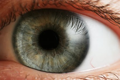
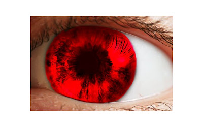
Before^
This took a while to get the hang of. I started out by using the circular select tool and selected an shape bigger than the colored part of the eye. Then i went to Colors->Filter Pack. I checked the box that said hue and then started selecting my color. After i got the right color. Then I applied a layer mask. Using that and the fuzzy paintbrush, I started taking out the red where it was not needed. That took the longest. After all of that i took the burn tool and highlighted some of the dark parts in the eye (lines, dark patches etc.) After all that I took the smudge tool and made the vein in the bottom right part of the eye a little less visible.

i used some brushs and some colors like green,brwon,black and red

Race for the Cure

I used two pictures - one of my mom and her friend, and one of my friend and me. I then pasted myself onto the picture of my mom and her friend. The big problem was that I had my body turned the same way as my mom, so I had to flip myself. I then used the eraser tool to eliminate my friend and the background from my picuture. Once I sized it right, I realized that my mom's friend's head was still slightly visible. So I selected my face and stretched it out a bit, covering up the side of her face that was still remaining. I then had to smudge most of my face to eliminate the lines across that had come as a result of stretching out my face.

With the shirt, my picture was taken in much different light, so I had to change the shirt color to match my mom's. I also had the problem that the word Crusaders was now reversed on my shirt. I took another picture of my sister in her shirt, since her body was turned similar to how mine now was, and cut out the word Crusaders. I then pasted it on to this picture, rotated it a bit, and recolored it to fix the same problem with lights.

Tuesday, September 22, 2009

old women

Monkeys Make Everything Better


It's true. Monkeys do make everything seem better. All this took was a resizing of the image and a little eraser work over the monkey's background. Then all it took was some political picture and voila!

Friday, September 18, 2009

Sunk


This is a ship that is at the bottom of the ocean, I just used the paint tool and did everything and put a new layer with a texture and a low opacity for the cool water effects.

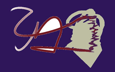
My name


tis is my name in English and Arabic so i used a pen to drawet
i hope it's fine .

Lady Gaga


So I thought this was pretty neat. I took a picture of lady gaga performing at the VMA'S last week, and decided to smudge it out and see what i could make it look like. The only tool I used was the smudging tool, and all i did was change the opacity levels. I think It looks kinda cool :] Lady Gaga FTW :D

Psychedellic


I used mainly filters for this, with a few splashes of color. For the big weird swirly things, I used IWarp. It's hard to say how I made this because I don't remember. It was just a bunch of random effects I liked the name of.

The Illusion Factor


Gents I present to you... the Illusion filter. All I did was make some random colorful shape in the center and hit the filter key. The result is rather nice. I'll have to remember this for photo editing.

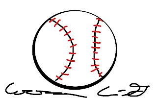
Fastball


Just a little something I put together in about five minutes and thought turned out well. I made two circles with different areas of coverage to create the outlining effect.

Supernova

This picture was actually pretty simple even though it doesn't look it. I started out by going to filters -> render -> clouds -> difference clouds. I then checked the turbulent box. After that i went to colors -> color balance then I played around with shadows, midtones, and highlights until i got the red/orange colors. From there I went to filters -> render -> line nova, set number of lines to 800, sharpness at 1.0, offset radius to 190, and randomness 50.

Thursday, September 17, 2009

The Moss Man

This picture was fairly hard to make, mainly because I'm not used to drawing people, and making the overall outline of the man was tricky, since it's quite hard to hold the brush steady while drawing curves. After I finished the outline, I filled it in as best I could with a dark green/ light green gradient, which really only covered part of his face, but allowed me to start the rest of him as well. I mainly used the galaxy brush to fill in the darker green and light yellow parts of him, such as on his head and shoulders. For the mossy effect where it is turning to flesh, I used the smudge tool as well as the sand dunes brush. The countenance was the hardest part of all, again because of making curves and positioning them just right so that they were proportionate to each other. The lambs and trees were made using the airbrush tool, and changing the opacity from high to low until they seemed to go well with the rest of the picture. Overall though, I'm a little unhappy with the way this came out because it's not as realistic as I want it to be. If anyone could give me some tips to help me make this piece more "realistic", I would very much appreciate it.

Stained Sarah


When I was deciding what to do for my next post, Sarah was playing around with gimp, and created something that looked like stained glass, so I decided to draw Sarah, making it look like stained glass. Though in the end it doesn't look too much like her, we decided she was the inspiration.

So to do her face shape, I used a picture of her as a guide and used the Paths tool to draw the basic outline of her face. A big part of this picture was the various brush sizes, and I chose a slightly smaller brush and the Paths tool once again to do her hair. I then went back to the regular sized brush to hand draw some of the major features, such as eyes, eyebrows, and the nose. One of Sarah's distinctive features is her "smile lines" (as she calls them), but I wasn't sure how to draw those in. After I got that all in, the tedious work came along. Using shift to make straight lines, I drew in the "glass" on her face. There was no rhyme or reason to the shapes, but I just wanted to make sure they were not all the same. Once I finished all the lines, it was coloring time. This took much longer than expected. I used the color picker tool to get the color from Sarah's forehead as my base color. Because her forehead and her right cheek are more in the sun, I wanted to try to make those lighter. I would vary the colors slightly as I went and eventually deepened the color as I got to her ear and the left side of her face. The hair was really hard. With Sarah's blond hair, the color picker tool made the color out to be much more gray than I wanted, and the roots were much too brown. So I decided to make her hair a little more golden than it is. I chose darker shades closer to the roots, and then gradually lightened them, really trying to put a variety of different shades in, similar to the face. I then filled in the mouth and white part of the eyes, varying the colors a little again. For the eyes, I used the airbrush and the smudge to mix some greens and golds and browns and added pupils w/ the black paintbrush. Sarah just chose her background, but I could probably go back and create a stained glass background later, but I probably won't.

john bapst


this is for our school john Bapst
with DIGTAL MEDIA

go Bapst

I Started The Fire


A pic I created to test creating fire in Gimp. I had to get close with the zoom and then make layers of yellow, orange and red. After I filled them in I blurred the whole image and I think it generated a nice effect.

Okay, just playing around again, but I found a really neat technique to extract the foreground. This allows you choose an area of your painting and bring it to the front; whatever you do next will only happen to the front part. (It's like a layer, but you can do this if you realize you need something to act like a layer but don't have one.)

Used path's tool to make the squiggles. I used foreground select and chose a section on the far right to bring to the foreground. The instructions on the tool are pretty self-explanatory. I was then able to smudge that area without worrying about precision. I then used the paintbucket in the same area, but the foreground select made it so that the smudged area couldn't get covered. I think I still like using layers better, but this technique is definitely helpful if you forgot to make one.

first time :)


it's face and his heir look like fire and he is angry i used some color like yellow and red

Gingerbread house!

What i did was to first decide where the horizon would be and drew a straight line with the paintbrush. From there I filled the sky in with blue with the airbrush, then smudged it for a more real look. Then I filled in the grass by going line by line with the paintbrush, and drawing a straight line(pressing shift). Next, I drew a path up from the bottom to about where I envisioned the house would be. I drew two straight gray lines with the paintbrush, then for the rocks i drew oval shapes and filled them in with the airbrush. Then I drew the house by
drawing four straight lines in brown, then I drew a triangular one for the roof. I drew a squiggly line in white for the frosting roof. I filled the roof in with "gumdrops" by choosing different colors and drawing circles. To get the shiny, sprinkle-like effect I selected the confetti tool and sporadically clicked. For the candy cane windows, I draw four lines in red for each, then in a light blue i added diagonally lines. The two candy canes on each roof were made by drawing a candy cane shape with the paintbrush in light blue and adding blue stripes.

I could not decide how I wanted to a do door so i decided to fill in the exterior with graham crackers. I drew squares with a light brown in paintbrush, and filled them in with the air brush. For the holes, I zoomed into 200% and drew circles with black. I did the fence with a straight white line and drew the fence posts with paintbrush. I added cliffs by drawing in brown and filling it in. The clouds i did by drawing cloud shapes and filling and smudging in the white.

Wednesday, September 16, 2009

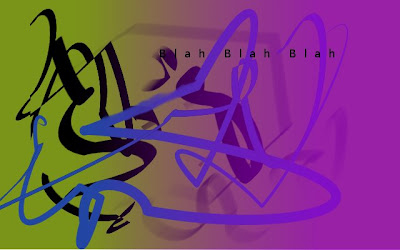
Blah, Blah, Blah


I did this one solely to play around with some tools--layers, gradients, and the paths tool.

The path's tool enabled me to get a flowing scribble. To use the tool put in the basic straight outline. Once you're done putting in the pivot points (they are the little circles that come up with you put in the lines) you are able to select certain line segments and change them to curves just by dragging the section around. If you click out of paths right now everything you drew would go away. To get the outline to stay, you have to go to Stroke Path (under the tool), select the tool you want to use (for me, paintbrush). You have to have the tool already set up with the color before you set the stroke path.

I played around with the text box. No matter what I did I was not able to get the dotted line around the box to go away.

I had a lot of fun with the gradients. I played around with the opacity of the gradient and the direction of the gradient. There's a box next to the gradient which changes the direction. I haven't played around with the shapes under the gradient, but they look pretty cool.

I still need to figure out the move and select functions. I tried playing around with them when I made this but I couldn't get it to work.

Wormhole


This Is my version of a wormhole.
First I made a black background, and a new layer. I then went to "filter->Line Nova..." and set it to 100 line. Then I made a new layer and made plasma with "filter->Render->clouds->plasma..." and set it to 4.0 turbulence. I set the plasma layer to overlay. I then colorized the plasma to look like this.
I think It looks like a really cool wormhole with cool colors.

What do you feel when you see this?


I first started this by just using shift to draw a straight line across the page, and soon i was using the paint tool to draw a a different color line across each side, but each color was different. I finally used the smudge tool and made it go inwards each time. Finally i added the center part and i smudged that.

I was wondering what feeling you got when you first saw this.

Looking At Heaven


Just a Little rendition of a picture I found online. I mostly used the airbrush for the colored stars and it dosn't show as well in this window for some reason.

Water Canvas


This picture only took 2 different tools. I used the ink tool and painted curvy lines in random places. Then i took the smudge tool with a large calligraphic brush shape and I smudged the color. I then repeated the same process with the different colors, still only using those 2 tools.

Chibi Girl

HI!

I am big into anime and manga (Japanese shows and comics) and I went online trying to find easy 'chibi' pictures to draw. Chibi means short or small, generally cute person. I came across a bunch of different pictures and saw that there was a 'How To Draw Chibi' and I went from that. I first drew here head, disporportionate to her body with the ellipse tool and then added the eyes with the paintbrush. I drew her body, but not her hand with the paintbrush tool. I added her shirt, and colored it in with a purple color after zooming in. I then drew in her pants as a gray color and her shoes as black. I zoomed in a little more and drew her open hand with the smallestt round paintbrush there was and went back over it with the second smallest, so it wouldn't look as weird. I then drew in her hair, deciding on a yellow color, aadding the sterotypical cowlick at the top. Not liking the way it looked at added hues of a darker yellow with the airbursh tool and then added some white to it as well.

I then outlined her with the free select tool and and opened a new picture. I added the gradient 'sunset' or something like that from the top to the bottom. I took her and pasted her on the picture and positioned her, so she looked like she was standing on the ground. She had a white outline around her still so I zoomed in and started using the color pick tool to get the colors of the sunset and painted in the white spots around her. I took the smudged tool to the outside of her, so it didn't look messy. I realized that she didn't look good with white skin and found a shade of tan than didn't look good zoomed in, but looked good when you zoom out to this size. I used the airbrush tool and the white color to add some depth to her skin color. And that's my chibi girl. I could probably draw one a lot better though...

Tuesday, September 15, 2009

Balloons!


I made this off of a picture I found online. I used a lot of layers (background, tree, grass, balloons) so I could easily erase mistakes.

The background and grass were done entirely with the airbrush and smug tools. I airbrushed colors in then I'd smug over it to make it look less choppy, and then I'd take the airbrush to it again. The key to all the airbrushing I did was turning the opacity down; it allows the colors to blend and look more natural.

The tree is a combination of the airbrush and paintbrush. I painted the main color in with a round brush then put in secondary colors with the calligraphy-shaped brush. These were smudged together, and then I went over it again with the calligraphy brush; that's what makes the tree look scribbly.

The balloons were painted in with very small paintbrush. To add the highlights and shadows on the balloons, I zoomed in 200% on the image and used a very small airbrush in either dark gray, black, or white. I tried to use the paintbrush but the opacity of the paint didn't look right. The balloon basket was done with one of the specialty paintbrushes in opaque paint.

Wheel


I was listening to a John Mayer song called "Wheel" while I was making this picture. I first started with a mixture of blues, purples, and black as the background. I smudged it all together so that it would look real. Then, I added some clouds, but not too much because its nighttime. Then, I moved on to the notes on a different layer. I went online, and found the sheet music of the song, and drew the notes on the lines that I made. Then I added some moonlight. And the yellow at the bottom of the screen is suppose to be like a city glowing, but I dont think that I did a very good job, but I did my best! I added the text with the tool on gimp and just messed with the color and the font.

Some more of me messing around with the filter features. To get this effect I used the cartoon feature under Artistic and got this I could have cartooned the sun but it didn't look too good to me so I didn't leave it.