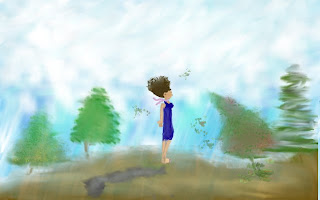
The picture that I created was extremely hard to do. Well actually, it was the girl that was the hardest. What I had to do was, start the background. I used one of the patterns that was already on Gimp. Then, I added some clouds and began to smudge it all together to look more realistic. I made some trees next. I used the calligraphy brush to make the trunks. For the leaves, I used one of the brushes that was more faint. I added a bunch of different greens to add texture, and to also make it look more realistic. The one tree I did that was slanted, was to give a windy effect to the scene. The ground was just browns that I blended all together.
The girl on the other hand, was much more complex. I had to make her on a completely different layer that was transparent so that when I copied her, I wouldn't see anything else other than her. I had to start with the skin on her face. I zoomed in so that I could get the basic outline of what her head was going to look like. I used a couple different skin tones to make her look realistic. Then, I added the hair with a brush that was also more vague than a regular paint brush. I then, worked on her facial details. Then I used the paint brush to do the outline of her dress, then colored it in with a larger brush when I was happy with how it looked. I then added arms, hands, legs, and feet. the limbs were easy to paint. The more challenging part was the feet. I had to shade in the bottom of her foot so that you would be able to tell what the underside of her foot was. I added a ribbon, and then, I was happy with how she looked.
I had to select her, and then paste her on the background that I had originally made for her.
I made her shadow by pasting her onto a new layer, and turning her black and white. I then, blended colors to make it look more even.
I didn't want the shadow to look perfect though. I was going for a rougher look because I wanted it to represent the old body/ person that she was. The girl that you see is the new girl who changed her life for the better. She's renewed.
Sarah, where's the girl????
ReplyDeleteVery well drawn person.
ReplyDeleteI really like one of the trees because it looks like it is actually blowing in the wind. Also I can tell you spent some quality time on the girl, she is really detailed. good job!
ReplyDeleteThank you guys! She was extremely hard to draw, but well worth it! :]
ReplyDeleteI really like how the girl turned out. How were you able to select just her, copy, and paste her onto a new layer? I must be doing the selection wrong because I haven't been able to get any to work.
ReplyDeletei created her on a separate picture, then selected her, and added her to my picture by copying and pasting her. i think... haha
ReplyDeleteSarah, I really like how much you put a direction in the picture. With the wind, the shadows, and the leaves all heading the same direction, you really created a uniform picture.
ReplyDeleteThank you! it took quite some time, but, it was worth it!
ReplyDeleteThis is fantastic! I especially like the girl's hair, it's really hard to do even when it's not moving
ReplyDeleteThat technique finally worked for me too. Thanks!
ReplyDelete